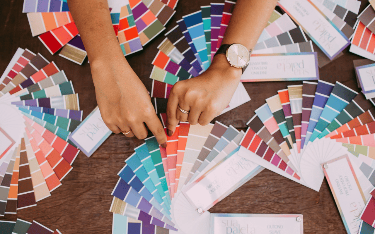
Choosing the right paint color for your home goes beyond aesthetics—it’s a science that impacts mood, perception, and even functionality. Different hues can evoke emotions, enhance light, and alter the perception of space. Whether you're looking to create a calming retreat in the bedroom or a lively, energetic vibe in the kitchen, selecting the perfect paint tones is key to achieving the desired atmosphere. Here’s a guide to understanding the science of color and how to use it effectively in each room of your home.
Understanding the Psychology of Color
Before diving into specific room recommendations, it’s essential to understand the basics of color psychology. Different colors have the power to evoke distinct emotions and reactions. Understanding how these colors influence feelings can help you create spaces that not only look beautiful but also serve their intended function.
Warm Colors: Energetic and Inviting
Warm tones like red, orange, and yellow are known to stimulate energy and warmth. These colors can create a cozy, welcoming atmosphere, which is why they are often used in social areas like kitchens and living rooms. However, in large doses, warm colors can sometimes feel overwhelming, so it’s essential to balance them with neutral or cooler tones.
Cool Colors: Calm and Relaxing
Cool tones such as blue, green, and purple are associated with calm, relaxation, and peace. These hues are great for bedrooms and bathrooms where relaxation is the goal. Cool colors can also make a room feel more spacious, making them ideal for smaller spaces.
Neutral Colors: Versatile and Timeless
Neutral shades—white, gray, beige, and taupe—are timeless and versatile. They provide a blank canvas that allows other design elements to shine. Neutrals are also perfect for creating balance and offering flexibility if you plan to change décor frequently.
Choosing the Right Color for Each Room
Now that you have a basic understanding of how colors affect mood and perception, let’s look at how to apply this knowledge to different areas of your home.
Living Room: Warm and Welcoming
The living room is often the hub of the home, where families gather and entertain guests. The goal is to create an inviting and comfortable space. Warm tones like soft yellows, terracotta, or muted oranges can create a friendly and cozy atmosphere. These colors promote conversation and connection, making them ideal for social spaces.
If you prefer a more neutral palette, consider adding pops of color through accent walls, furniture, or accessories. Light greys and beige tones provide a soothing background while still allowing for warmth and comfort.
Kitchen: Energizing and Vibrant
Kitchens are lively spaces where families come together for meals, cooking, and conversation. Bold, energetic colors like red or yellow can stimulate appetite and conversation, making them popular choices for kitchens. However, since these colors can feel intense in large quantities, it’s wise to use them sparingly—perhaps on one accent wall or in the form of vibrant cabinetry.
For a more modern or relaxed vibe, consider cool greens or blues, which can evoke a sense of freshness and cleanliness. White and grey kitchens are timeless choices, offering a clean and open feel that can be enhanced with colorful accents like backsplash tiles or kitchen accessories.
Bedroom: Calm and Restful
Your bedroom should be a sanctuary—a place for rest, relaxation, and rejuvenation. Cool tones like soft blues, greens, and lavender are ideal for creating a calming, serene atmosphere. These colors promote relaxation and are known to lower heart rates, making them perfect for unwinding at the end of the day.
For a more neutral look, consider soft greys, creams, or muted pastels. These tones maintain a soothing feel without being too bold, allowing for a peaceful and cozy environment that fosters restful sleep.
Bathroom: Refreshing and Clean
Bathrooms are spaces of refreshment, and the colors you choose should reflect cleanliness and calm. Cool colors, particularly blues and soft greens, are perfect for bathrooms as they create a spa-like atmosphere that feels fresh and inviting. Light blue or seafoam green are particularly popular for giving a sense of tranquility.
White is another popular bathroom color, evoking cleanliness and simplicity. It also helps small bathrooms feel larger and brighter. For a more modern touch, combine white with grey accents or black fixtures to create a sleek and sophisticated look.
Home Office: Focus and Productivity
For a home office, it’s important to choose colors that foster focus, creativity, and productivity. Neutral tones like greys and whites create a clean, distraction-free environment, while cool blues or greens can help with concentration and calm during long work hours.
If your work requires creativity, consider adding pops of energetic colors like yellow or orange to inspire innovation and ideas. The key is to strike a balance that keeps you energized without overwhelming your workspace.
Dining Room: Warm and Sociable
In the dining room, warm tones like reds and oranges are traditionally thought to stimulate appetite and encourage conversation, making them ideal for dining spaces. Soft terracotta or muted burgundy can create a cozy, intimate setting that feels both elegant and welcoming.
For a more contemporary dining room, consider cooler tones like slate grey or soft blue, paired with warm lighting to create a relaxed yet stylish dining environment. These shades offer sophistication without overpowering the room.
Lighting and Its Role in Color Perception
One important factor to keep in mind when choosing paint colors is lighting. Natural and artificial light can dramatically affect how a color looks in your home. Before committing to a color, test swatches in different lighting conditions to see how they change throughout the day.
-
Natural Light: North-facing rooms tend to have cooler light, so warmer tones may help balance this. South-facing rooms, with more intense sunlight, can handle cooler tones more effectively.
-
Artificial Light: Incandescent lighting gives off a warm, yellowish tone, enhancing warm colors. LED lights come in a variety of temperatures, allowing for customization of how colors are perceived.
Elevate Your Home’s Style with Thoughtful Color Choices
Choosing the right paint tones for your home can transform each room, enhancing mood and function while adding personal style. Whether you're going for a vibrant, energizing look or a calm, restful retreat, the science of color can help you create a home that suits your lifestyle and preferences.
For expert advice on homes and color choices in Southlake, TX, reach out to Hacker Property Group. Their deep knowledge of the local real estate market will guide you in finding the perfect home and making it your own through thoughtful design and color selection.